spotify redesign
INTRODUCING COMMUNITY FEATURE ON SPOTIFY MOBILE APP

role.
ux designer
aim.
make music sharing via spotify’s mobile app efficient
duration.
Nov 2020 - Dec 2020
problem.
Spotify’s current mobile app is lacking in social-related aspects, like song sharing.
Users often like to share songs with friends; however, the only way to do that is through tedious steps to copy a link and send it through an external messaging app.
Users want to be able to see what their friends are listening to.
Users want to share thoughts on songs.
user profile.

age: 18-25 years (median: 21)
job titles: College Student
interests: Music
activities: Listens to music regularly
education: Pursuing higher education
technology: Smartphone, Spotify Premium
disabilities: no specific limitations
root cause analysis.
user persona.

Jane Park
age: 20
school: UCLA
year: Junior
major: Biology
interests: Listening to music, Dancing, Hanging out with Friends, Hiking
other relevant traits: Sociable, Friendly
about Jane:
Jane is a pre-med student and studies for several hours a day, occasionally going out with friends.
During her late night study sessions, Jane enjoys listening to her favorite “Study” playlist on Spotify. She also loves to listen to music while gymming as it motivates her.
Jane shares music with her friends but finds it difficult to navigate through different apps to share a song. She prefers not to use her social media while relaxing and ends up not sharing as much music as she would like.
user scenario.

Jane arrives late in the evening after an exhausting shift at the hospital.
She has a long night of studying for a biology midterm but takes a quick break to eat dinner.

She listens to music while cooking to re-energize her mind. She opens ‘Stress Relief’ playlist on Spotify.
She sits down to study but still wants to listen to music so she can focus better.
She soon gets bored of her music and wants to find new music.

She opens the ‘Community’ tab and finds songs her friends are listening to and have sent to her.
She listens to those songs and suddenly her study session becomes more enjoyable!
card sorting.
objectives.
Understand how users associate social aspects to Spotify
Learn user behavior to create prototype for Spotify community
participants.
Taking the Fundamentals in UX class at UCLA
Regularly uses Spotify Premium on the mobile app
research questions.
How do users associate different aspects of the Spotify app?
How do users make sense of features within Spotify?
How are users’ domain knowledge structured?
proposed method.
We led a closed card sorting task.
protocol.
preparation.
Assemble a collection of 30 words and phrases that represent numerous aspects of Spotify.
Prepare the card sorting task using OptimalSort to share with participants during their study.
activity.
Participants are instructed to sort the cards into the given named groups, and asked to explain their thought process while doing so.
data.

5 categories for words: Community, Share, Social, Updates and Song Information.
Social is popular for direct interaction.
Community is chosen for general information and observation of others’ music choices.
key findings.
Chat was categorized into Social 5/5 times, suggesting that social aspects in an app are related to communication.
Sending a song is placed in Share 100% of the time. Using the word “Share” in our redesign will be important for the feature to be easily accessible.
Although the current Spotify app has no social features, users still relate aspects of the app to a wide range of social and community features.
quotations.
“I would associate Community with general and Social with personal connections.”
“Community and Share would be better than Social and Share.”
usability test.
objectives.
Understand how users associate social aspects to Spotify
Learn user behavior via prototype for Spotify community
participants.
Taking the Fundamentals in UX class at UCLA
Regularly uses Spotify Premium on the mobile app
research questions.
How do users respond to the addition of the community feature in the Spotify app?
Does the addition of the community feature satisfy user needs?
proposed method.
We conducted a usability test using a high-fidelity prototype.
usability test tasks.
We asked the user to navigate to ‘Community’ page. The following questions were asked for each page:
feed tab.
What do you think you can do on this page?
Please react to Ayushi’s post
Please create a new post for the feed and write a caption to share the song Mise-en-Scene
shared tab.

Please go see privately shared songs from friends
(on Shared page) What all do you think you can do on this page?
Please view your unread songs shared from Tanvi
Please go view your share requests from Joe Bruin
What do you think the share requests are for?
activity tab.

Please go to the page where you can see what your friends are currently listening to
(on Activity page) What do you think you can do on this page?
current song share.

Please share the song you are currently listening to Tanvi within Spotify.
key findings.
Participants found the design very intuitive.
The ‘Share’ feature was very useful because it removed barriers to sharing music with others.
Participants liked the reaction button to get feedback and interact with other users.
usability improvements.
Participants would like to react to privately shared songs as a way of getting some kind of feedback.
“Shared” vs. “Feed” tab labels were a bit confusing at first glance.
Participants habitually tapped the 3 dots at the top right to share the current song, but mentioned the addition of our ‘share’ icon was better usability.
quotations.
“I am in awe with the idea of sending within the app as I hate sending links of songs””
“I was expecting to react to songs on the shared page but it wasn’t there.”
“It’s really intuitive, very clear to see what I can do”
“I would be really frustrated if I couldn’t send text as well - I always include a description for why I’m sharing it””
high fidelity prototype.
After implementing all the improvements from our usability testing, this was our final product. We added in onboarding screens as well as reactions in the privately shared songs feature for a more enjoyable user experience.
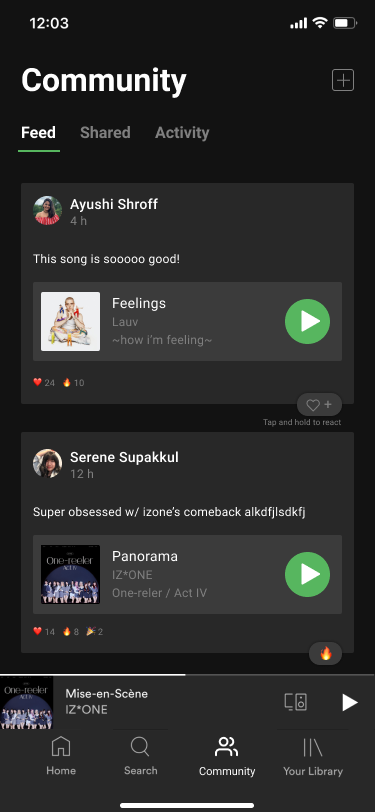
feed tab.
what is it.
Users can see and share with people they’re following and share posts with their followers.
Posts are a way for users to see and share songs and their thoughts on songs.
Users can also interact with posts by reacting to them with emojis and can also directly play the songs.
“I wish I could see what my friends think of songs and have discussions with them”
shared tab.
what is it.
The ‘Shared’ tab allows users to send songs to friends within the app.
Users can add a short message and react to song shares from friends.
To prevent spam and to preserve privacy, we added a “Share Requests” feature for song shares from strangers.
“Sharing music is hard. I feel like it should be in the app, like how you see friends’ activity on the desktop.”
“I don’t like having to send songs via text.”
activity tab.

what is it.
The ‘Activity’ tab allows you to see what your friends are listening to at the moment. Many users expressed a strong liking for the feature on the desktop app.
“I like that I can follow my friends and see what they’re listening to”
“One of my favorite things about Spotify is seeing what my friends are listening to on the desktop app.”
sharing current song.
what is it.
Users are able to share the song they are currently listening to with friends or to their feed by tapping the newly included ‘send’ icon beside the existing ‘like’ icon.
why is this included.
Sending the current song via the Community tab consists of many inefficient steps.
interact with the prototype by clicking on the Community tab below:
user feedback.
“Biggest component that Spotify is missing is definitely the social component, you’re definitely focusing on a need”
“I think this is a smart move [to allow song sharing within the app]; in order to stream a song on Spotify, you have to have a Spotify account unlike YouTube, where you don’t need an account to watch a video”
“I think this is awesome, definitely be something I use a lot if Spotify implemented this”
lessons.
user experience fundamentals.
I learned the seven fundamental principles of design that support discoverability and understanding to implement the entire human-centered design thinking process. I also learned several UX research methods and when to use them.
user feedback.
I was able to learn how to conduct user research and learn how to interact with them to meet our objectives. Incorporating feedback after watching users interact with our prototype made me realize how different perspectives are important in creating a product with good usability.
teamwork.
Having a team working on different parts of the user experience design was a unique experience for me. Communicating with the team to understand our findings and compiling it to create a unified final product was an important learning.