charipay
CAUSE & CHARITY CENTERED DONATION PLATFORM
background.
The founders wanted to expand their reach and make this donation platform more accessible, as it is currently only available as an iOS app.
The app was also lacking some features of personalization and habit-formation in customers.
I joined the team to help tackle these issues!
role.
ui/ux designer
aim.
create a mockup of a user-friendly donation website with personalization features.
duration.
feb 2020 - sep 2020
initial sketches.
The founders had a basic vision of what they wanted the website to look like. They provided us with sketches that served as guidelines for our design process.

draft #1
Our first draft was in accordance to the sketches provided to us.
After reviewing the screens, the team unanimously decided the website needed a more modern look to make the platform more approachable, aesthetically pleasing and reliable.
We decided to start from scratch.
style guide.
Our first step was to establish a style guide for the designers’ reference as well as for the developers.

colors
we chose different shades of blue as the color is often related to a sign of stability. This aimed to increase users’ confidence in this newly introduced donation platform.

fonts
We chose our display font to be modern looking serif font as fonts with more “personality” tend to induce lesser emotion from a user. The font for our content was a sans-serif with several typefaces so that the font is legible, usable and minimalistic.

components
we created commonly used components such as buttons, tags, a search icon, a location icon, etc. I chose a minimalist style with outlines so that it is easy and intuitive for the user to identify.
inspiration.
We decided to research how other common donation websites are structured, while considering the target of the design. The pages we took most inspiration from were World Wildlife Fund, American Red Cross and surprisingly, Netflix.
Our main takeaways were:
explore.
WWF and American Red Cross allowed users to explore various ways to donate.
prompt.
These websites prompted the user to fill out information as soon as they got to the donation page so that there are no additional hurdles before donating.
discover.
Netflix’s user experience for discovering new movies and TV shows provided an excellent sample for how we can encourage users to discover more causes and charities.
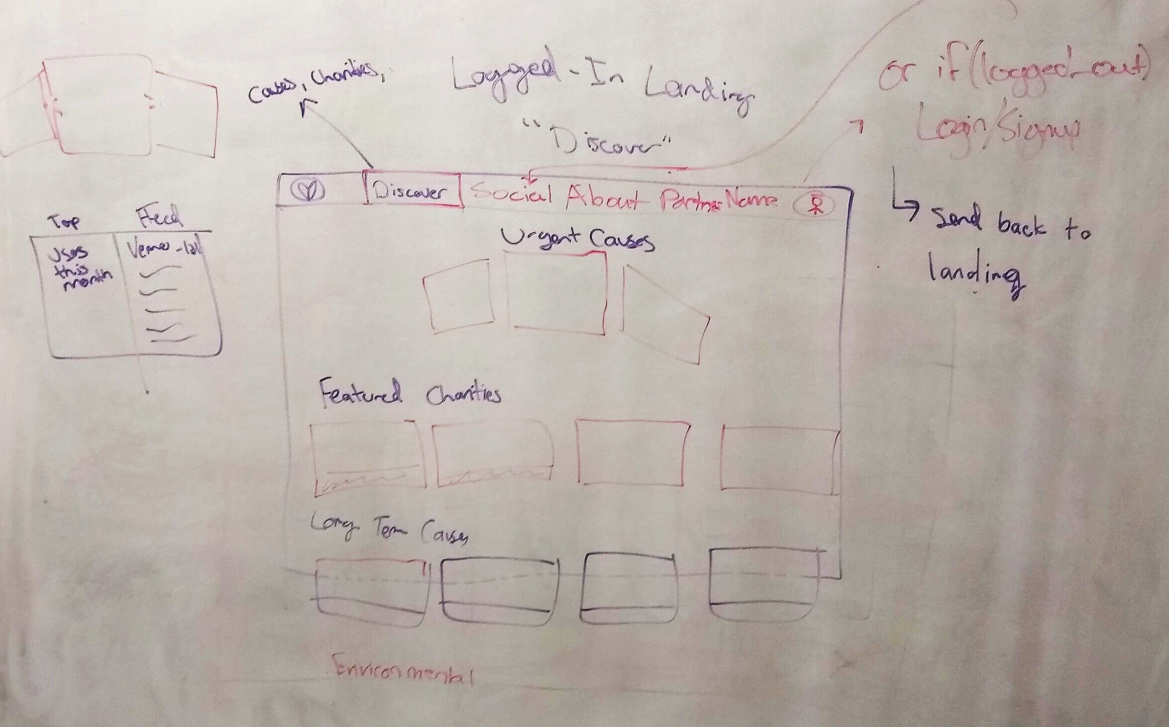
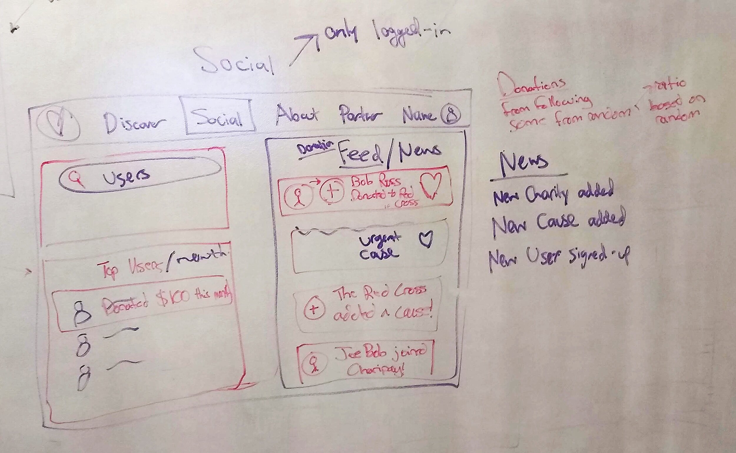
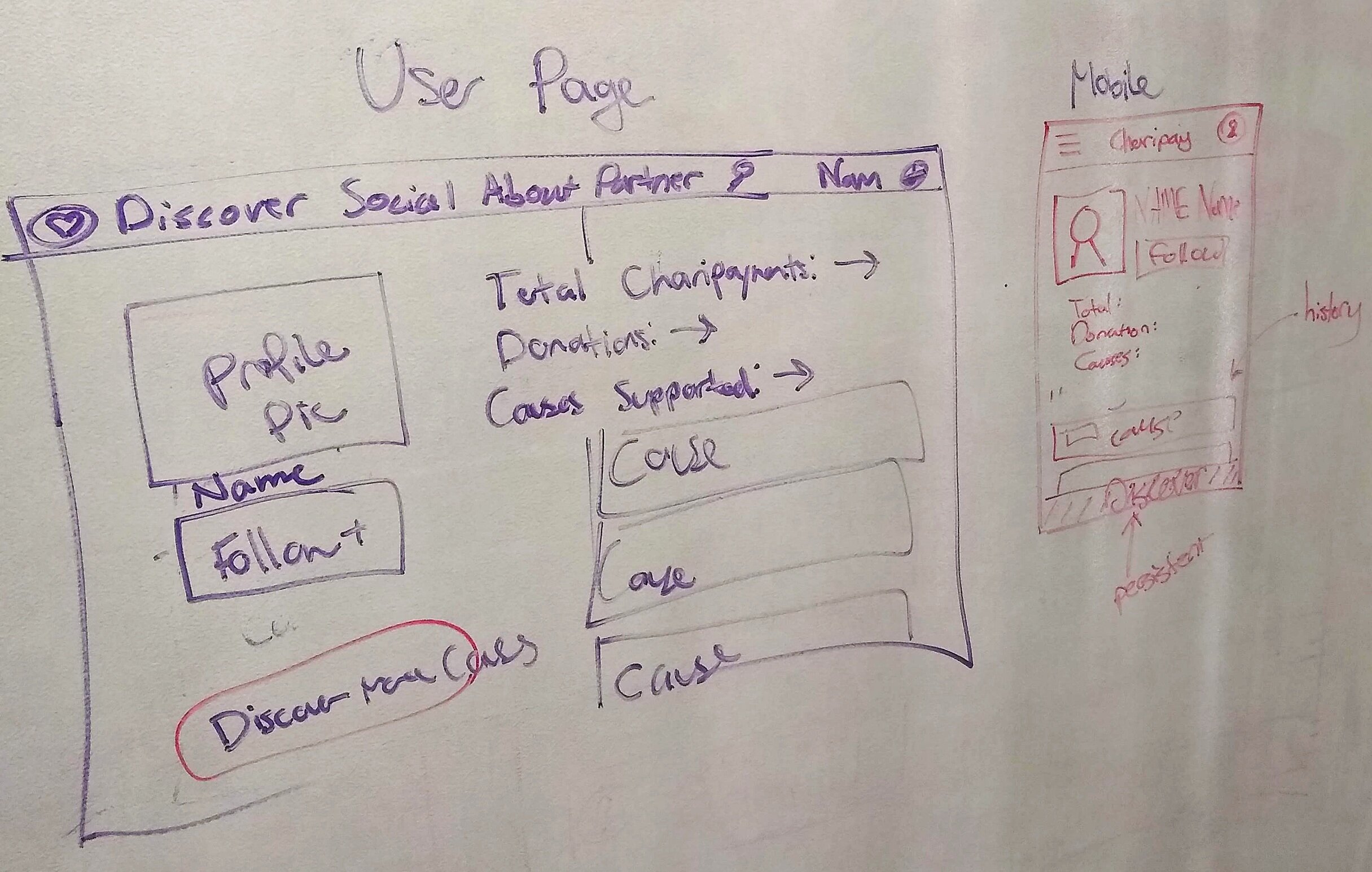
user flow.
We came up with a user flow that included all the routes a user could possibly take through the app, while including the different areas of personalization and techniques of forming habits in the user.
concept sketches.
Andy & I brainstormed various layouts the Discover pages as well as the Cause and Charity pages could have. Our main aim was to personalize the platform & to provide relevant causes for users to donate to every time they log in.

development team inputs
We had a meeting with the head of the development team to inquire if our ideas were feasible. Taking into consideration their restrictions, requirements and the time limit, we went forward.


personalization and habit formation.
featured.
featured cause/charity which would differ based on the user’s past behaviour as well as popularity of the cause/charity.
saved.
saved section for users to access causes/charities they might want to consistently donate or look at later.
similar charities.
recommend similar charities after donation is made to prompt users to discover further.
payment method.
logged in users can save information about their payment method.
recommended.
recommended causes/charities based on previous user behaviour.
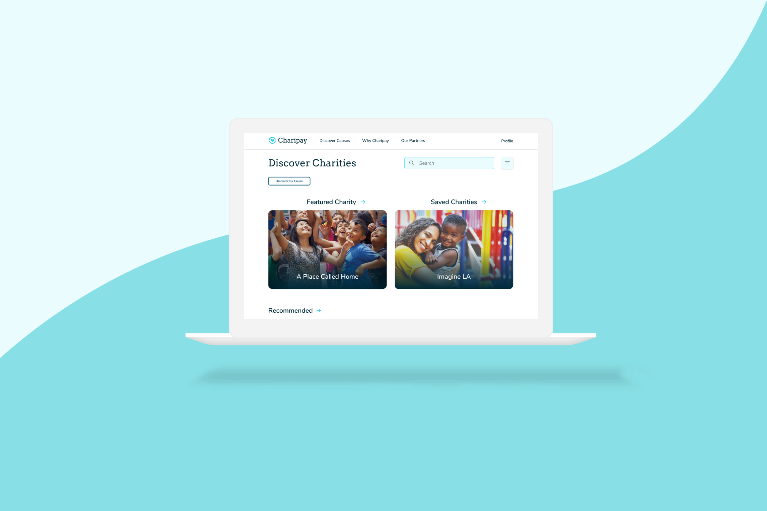
high-fidelity wireframes.
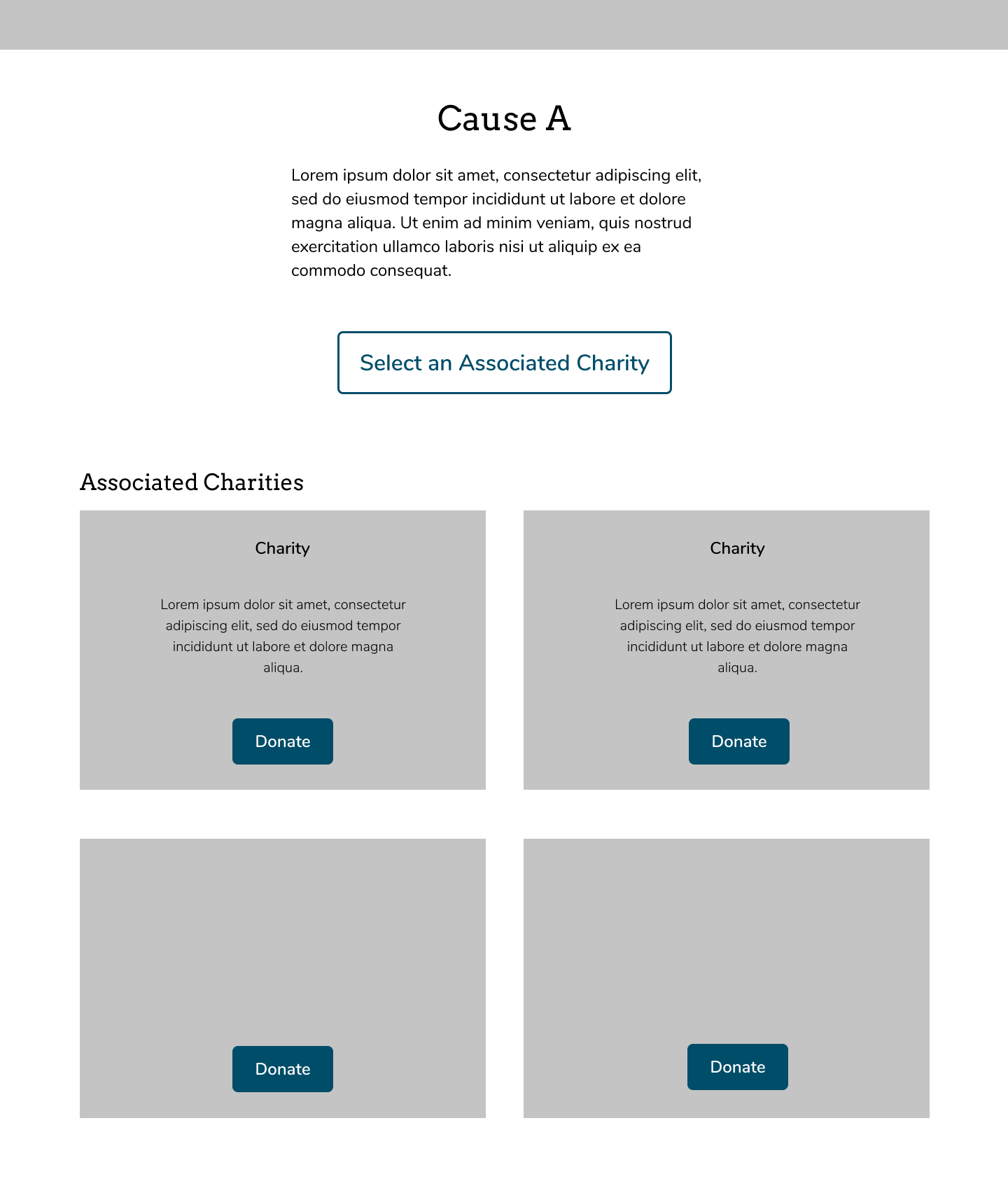
We were finally ready to create our wireframes. Andy & I split up the work equally - he took up all the screens for causes & I for charities. We decided to adopt similar styles based on the sketches but different enough for a user to distinguish between charities & causes.
discover
donate
lessons and next steps.
teamwork.
This was a very crucial learning for me, as being a team member who communicates clearly as well as hears the other member’s ideas is super important. This worked out great between Andy and me as well as the developers.
communication.
Being able to describe our ideas with clarity in a cross functional environment - to the stakeholders as well as members of the development and marketing team with clear reasoning. This experience definitely helped me learn how to do so.
dev team’s inputs.
Hearing out the dev team’s ideas helped give us more direction and actually made the process a lot easier, as we knew what was doable and convenient for them to get the website up and running ASAP.
next steps.
The developers are currently working hard to convert our designs to reality. The website has just launched (but it’s at a very primitive stage)! In the meantime, Andy & I will try to brainstorm more features for the website and sketch out some new pages and upcoming features.