wazo connect
APP TO MAKE MENTAL HEALTH SUPPORT AVAILABLE TO ALL

background
Wazo Connect is a club at UCLA that trains mentors and connects them to mentees for mental health support. They wanted to expand their reach by creating an app.
I joined along with 2 other designers to turn the organization’s vision to reality!
role.
ui designer
aim.
create high fidelity wireframes for an app while keeping in mind the users.
duration.
Nov 2019 - Feb 2020
chat feature.
We split our work by different features of the app. I chose to work on the chat page. We had a basic skeleton but wanted to create a cleaner design and add some more options. We first went through some redesigns of the existing pages and then introduced new features.
redesign.
text boxes.
Both the sender’s and receiver’s text boxes originally had the same fill color. To distinguish between them and follow common social media messaging design patterns, I changed the colors. I also made the background white to make the design minimalistic.

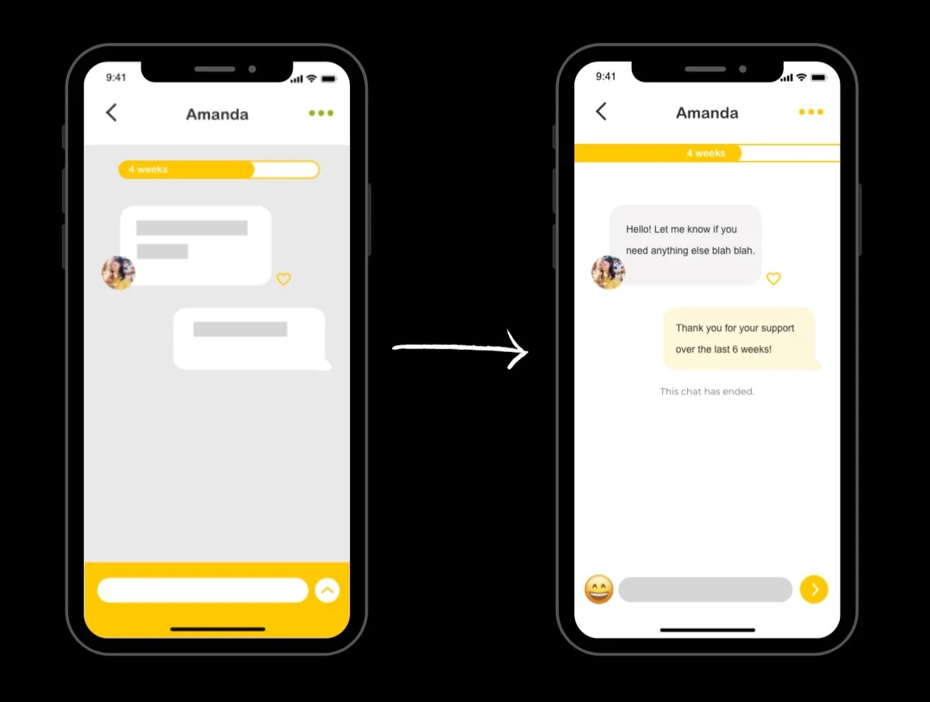
waiting for mentor.
I added an outline to the “Start a New Chat” button to make sure the call-to-action is clear. I also took the grey background out of the “Mentor” section to make the text clearer. After exploring different styles for “+ Expand” button, we decided to go with “+ More” as the action was understood better.
new features.
I suggested having different colors for the chat boxes according to moods to help track the mentee’s progress. We chose the colors based on the emotions in the Pixar film Inside Out. We also decided to use different emoticons to be able to intuitively switch the mood. The emoticons used in the mockups for simplicity purposes were iOS emojis (until we developed our own).
colors for emotions.
red = angry.
purple = worried.
blue = sad.
green = disgusted.
yellow = happy.
orange = unsure.
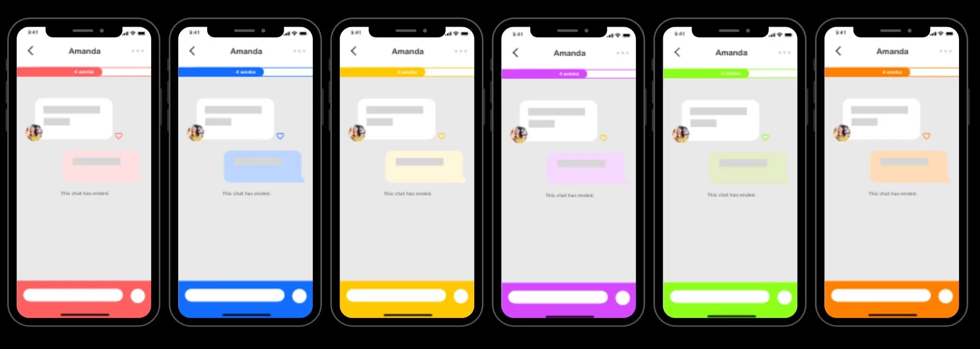
first draft of the chat screens with different color options
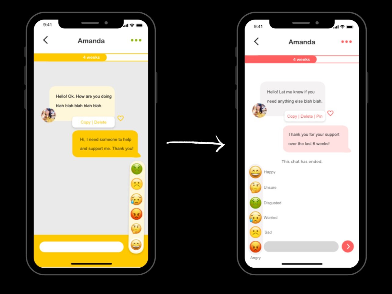
emoticon placement.
The emoticon button was placed on the left of the text box so that it is not confused with the “send” button.

After consulting the team, I finalized the chat screens. We decided to go for lighter and soothing shades.

pin messages.
We added a “pin” button for a mentor or mentee to keep track of useful and important messages.
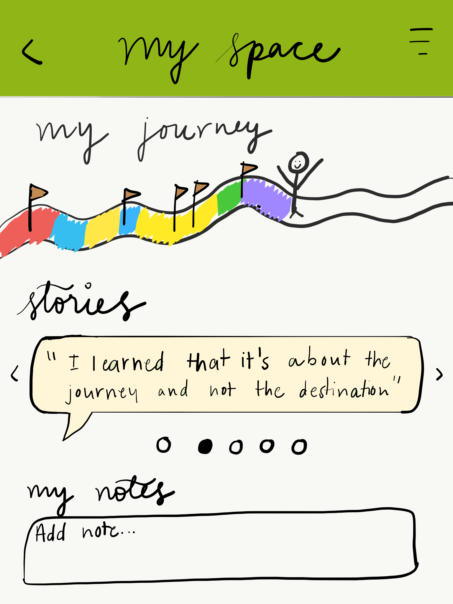
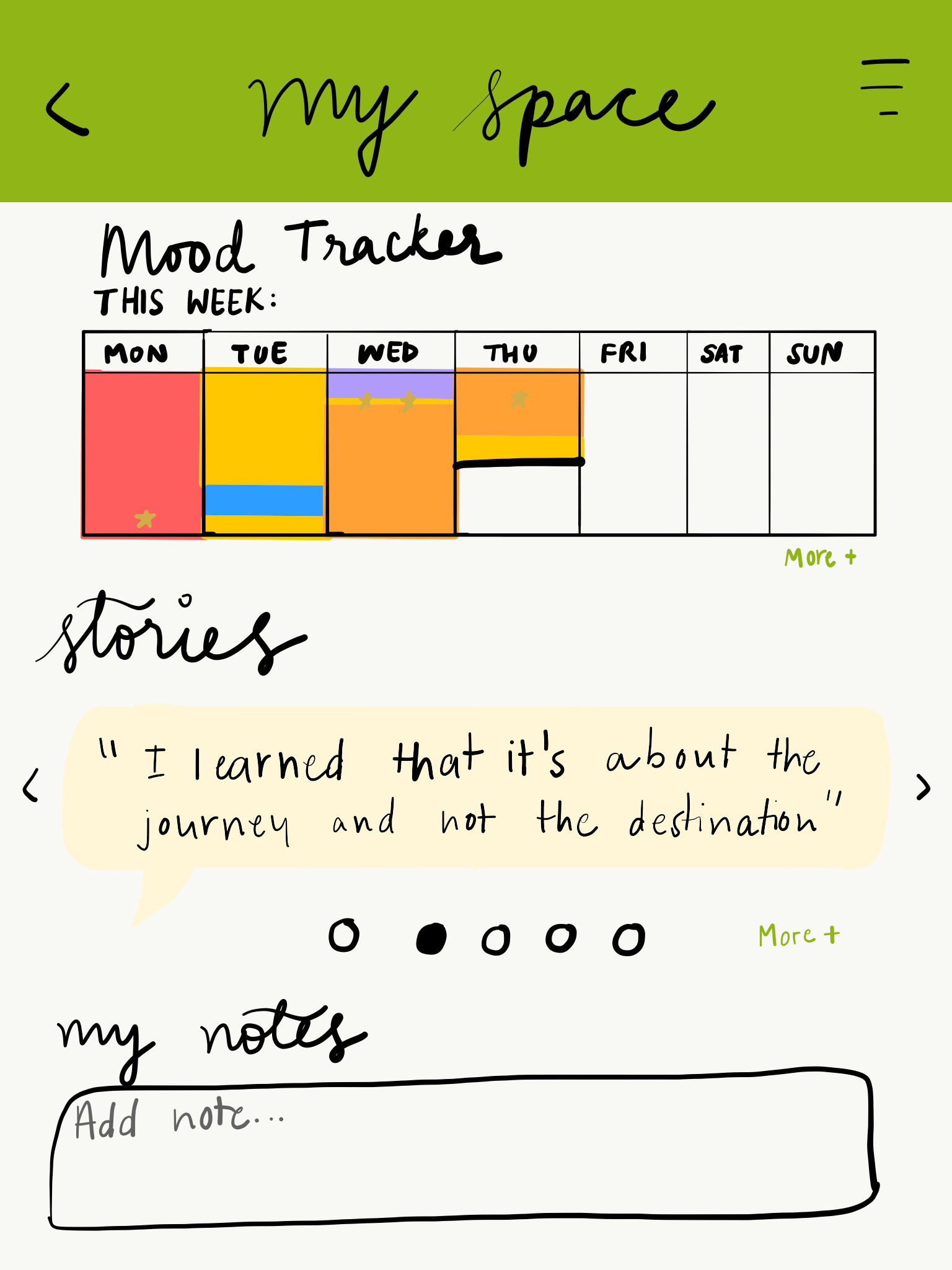
my journey feature.
purpose of this page.
making personal notes.
timeline to track moods.
achieving goals.
ideation.
Each of us came up with different ideas for how this page would look. These are a few pictures I found online as well as some sketches I made.

final screens.
mood tracker.
A simple grid that can be viewed on a daily, weekly or monthly basis.
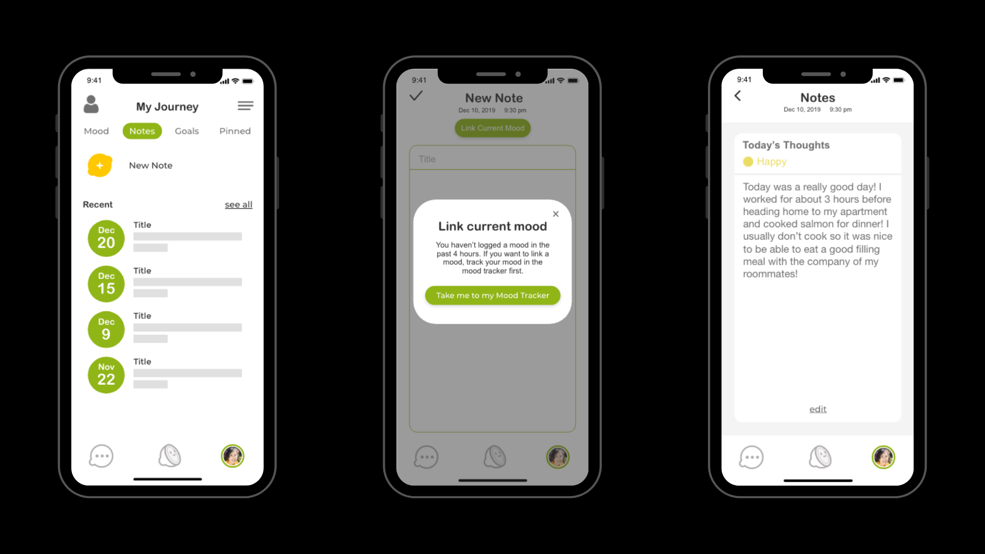
notes.
All notes are private to the mentee. The mentee can link their current mood to this note as this could help them while viewing their notes in the future.
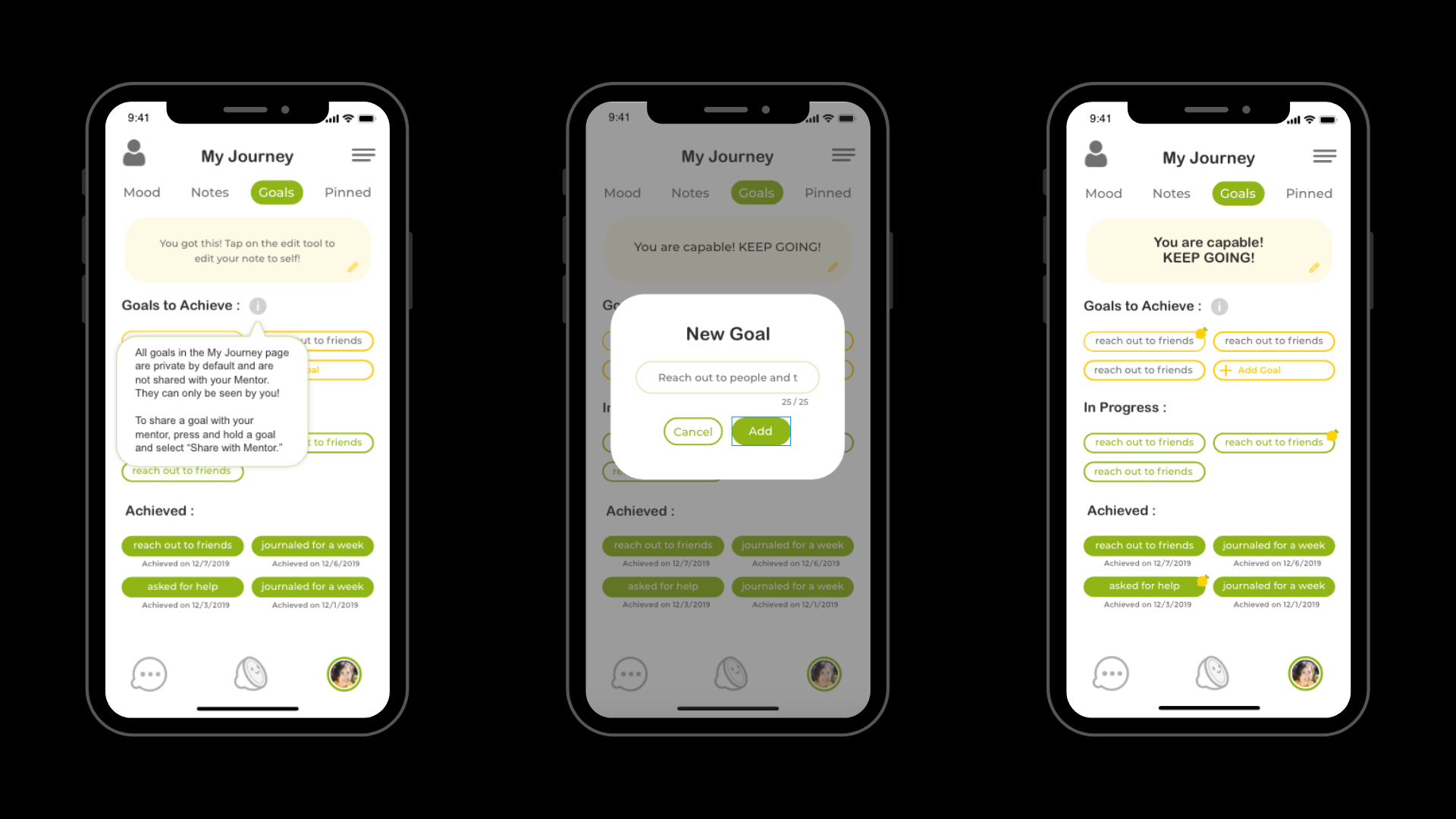
goals.
The goals page is by default private to the mentee. If the mentee prefers, they could share specific goals with their mentors (which is indicated by the lemon icon).
mentor training.
the goal.
Have a compiled list of videos that a mentor can watch along with playing some games and getting quizzed at the end.
Although this is not finalized, we know the areas of training a mentor will require. I split these up intuitively into 4 different “modules” and designed the buffer pages in between the stages of a mentor completing their profile and the actual training session.
final screens.


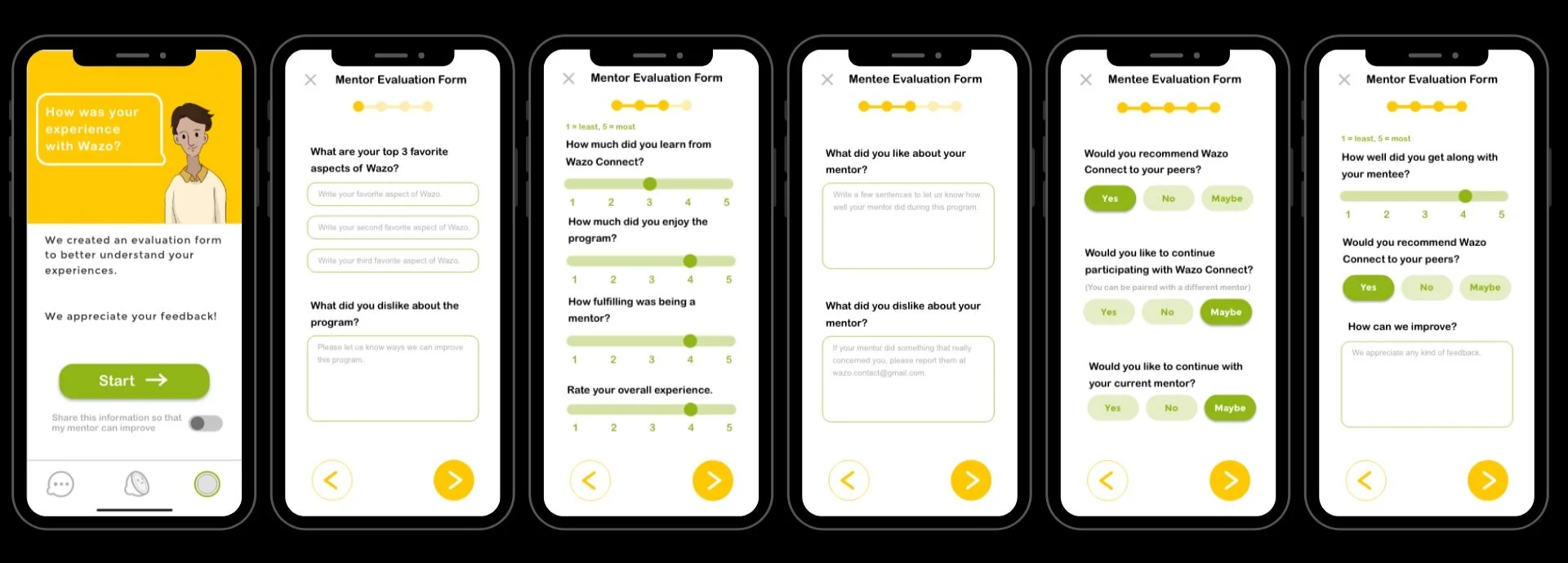
evaluation forms.
Another feature that we wanted to included was for mentors and mentees to provide feedback after the mentorship period ended.
samples.
I was given Excel sheets that consisted a list of questions and a sample of the answers.
final screens.
lessons.
practice.
Doing an internship during the quarter for which meetings were thrice a week as well as constantly something new to work on was very interesting. It kept me on my toes and helped me practice my Xd skills.
cause.
Working towards such an important cause always kept me motivated. Mental health is a very broad spectrum, so keeping in mind that the audience we are designing for has a wide range made me reevaluate my decisions, receive helpful feedback and made me more sensitive towards those in need of support.
team.
Having other designers around and working in a team made me further develop my prototyping as well as communication skills. I was able to get constant feedback and improve.